

In this Leiout tutorial, you will learn about the different parts of the toolbar. Each layout container and element has a toolbar but the toolbar options may vary based on the container or element.
You can find the toolbar by pressing the cog on the container or element handle. Some options that all of the toolbars have in common are...
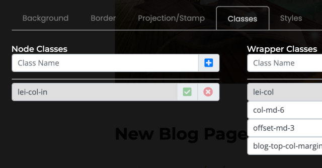
Background Tab
This tab allows you to set the background image. You can either choose an image from the media library, which has all of the images that have been placed on the website previously, or you can upload images by choosing browse.
You can choose the aspect ratio of the image and crop it accordingly. You can also choose the background size. The default size is cover but you can change it to no repeat, repeat auto, and repeat size. If you choose repeat size there are more settings to choose from such as the width and height.
Under this tab, you can also upload a background video but it needs to be in an mp4 format or it will not work.
Styles Tab
If you look at the styles tab, you will see the styles you specified for the background image. You can change these, delete styles, or add new styles.
This area is where you can specify inline-styles though using inline-styles is not best practice.
Projection/ Stamp Tab
This is where you can turn a specific container into a projection or stamp in order to turn it into a pre-built item for use throughout the site. To learn more about projections and stamps, checkout out out projections and stamps tutorial video.
Attributes Tab & HTML/ Alias ID Tab
The toolbar also includes the attributes tab where you can add attributes such as data-offset, and the html tag/ alias id tab where you can define an html tag or assign an id to the container or element. For example, I can change a node tag to “p” instead of "div" which will change the style based on what we have specified in the CSS.
Hyperlink Tab
You can learn about hyperlinking and using the wrapper alias id in our hyperlinking and anchor linking tutorial video.
As you explore the different elements, you will notice different options in their toolbars. The heading element has its own special tab: heading. This allows you to change the heading priority from h1, h2, h3 and so on.
On the left side of every toolbar you will also see the options to minimize the toolbar, refresh the toolbar, check out the node settings, delete this node, or navigate through different nodes around it.

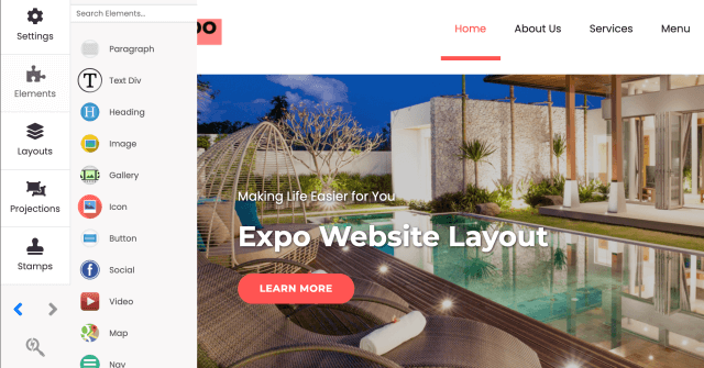
Let's learn about the Leiout Builder mode. Add containers, drag and drop elements, and change settings. These are the basic building blocks of building out a website. These flexible tools will allow you to create now, and change things up later.
This help article explains how to use Bootstrap toast with the AOS library in a plugin in Leiout!
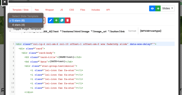
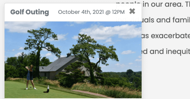
In this Leiout tutorial you will learn how to use and set up the plugin element for flexible and easy to update components on a Trolley Web website. You will learn about the different tabs in the plugin element template through different examples of ...
In this Leiout tutorial, you will learn about the different parts of the toolbar. You will learn about and how to use common toolbar options that all containers and elements have.