Bootstrap 4 has its guide here.
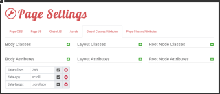
Add to the scrollable element (almost always the body tag):
xxxxxxxxxxdata-spy scrolldata-target .scrollspy
xxxxxxxxxx<li id="nav-137" class="nav-item slide" style=""> <a href="{LINK=link}" class="nav-link">{TITLE=text}</a></li>x
<div id="-plugin-{UNIQUE_ID}" class="navbar navbar-expand-lg"> <div class="container-fluid flex-column align-f-end"> <div class="navbar-brand"> <span>Navigate to</span> </div> <button class="navbar-toggler" type="button" data-toggle="collapse" data-target="#lei-navbar-content" aria-controls="lei-navbar" aria-expanded="false" aria-label="Toggle navigation"> <span class="navbar-toggler-icon"></span> </button> <div class="navbar-collapse collapse scrollspy" id="lei-navbar-content"> <ul id="nav-132" class="navbar-nav nav-menu -nav-root mr-auto flex-column"> {SLIDES} </ul> </div> </div></div>You must have:
When you scroll to that point the class “active” is added to the nav-link node. You can add CSS to make the active class look different. The body should have the class “position: relative;” as indicated in the scrollspy documentation. To add an offset add data-offset = 70 for a 70px offset. Default is 50px. Do this to the body.
The required utils.js is already included in Leiout, so no need to add any additional code!
Data-offset doesn’t do what you think it does. It controls how far the page scrolls up to the element before it adds the “active” class. If you want to offset the scroll point, do this with padding.


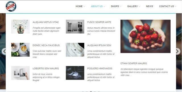
This article explains how to create and use the mega menu functionality in Leiout navigation menus.

This article explains how to install and use Google's translate javascript library and implement a b...

This help article explains the CSS mix-blend-mode property and how to incorporate it with hero image...