Once you have read a couple of the plugin articles, you may be ready to start creating more complex plugins that require more than one slide template! You can learn how to do so and some examples of when you may have to do this in this article.
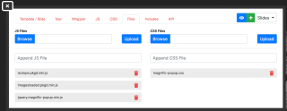
Creating a basic plugin is simple. First you need to drag the plugin element onto the page where you want it and add some HTML to the template/slide, nav (optional), wrapper, and any necessary files. I will show a simple example below.
x
<a href="{IMAGE=image_url|size:xl}" class="grid-item"> <img src="{IMAGE=image_url|size:sm}" class="img-fluid"></a>x
<div id="-plugin-{UNIQUE_ID}" class="wrapper"> <div class="grid">{SLIDES}</div> <div class="collection-label"> <h1 class="collection-title">Behind the Wall</h1> </div></div>x
#-plugin-{UNIQUE_ID}{ .grid-item{ width: 220px; @media (max-width: 511px) { width: 90%; } img{ padding: 12px; width: 100%; } } &.wrapper{ position: relative; .collection-label{ position: absolute; /*transform: rotate(90deg); transform-origin: left;*/ transform: rotate(90deg) translate(100%, 0%); transform-origin: right; /*right: -60px;*/ right: 0; top: 0; display: flex; flex-direction: row; justify-content: flex-start; flex-wrap: nowrap; align-items: center; width: 400px; @media (max-width: 511px) { right: calc(10% - 20px); } &::after{ content: ""; border-bottom: 1px solid gray; width: 100%; margin-left: 20px; } } } }/* Magnific popup */img.mfp-img { width: auto; max-width: 80%; height: auto;}.mfp-figure:after{ background: transparent; box-shadow: none;}.mfp-container{ //background: $gray-5;}/* Edit mode */.-lei-edit #-plugin-{UNIQUE_ID}{ .grid-item{ display: inline-block; margin-right: 4px; }}x
$(document).ready(function(){ /* // Method 1: Load all images, then init isotope var $grid = $('.grid').imagesLoaded( function() { //$('.grid').isotope({ // init Isotope after all images have loaded $grid.isotope({ itemSelector: '.grid-item', masonry: { columnWidth: 290 } }); }); */ // Method 2: Init isotope every time an image loads // init Isotope var $grid = $('.grid').isotope({ itemSelector: '.grid-item', masonry: { columnWidth: 220 } }); // layout Isotope after each image loads $grid.imagesLoaded().progress( function() { $grid.isotope('layout'); }); //Magnific Popup $('.grid').magnificPopup({ type: 'image', delegate: 'a', gallery: { enabled: true, // set to true to enable gallery preload: [0,2], // read about this option in next Lazy-loading section navigateByImgClick: true, //arrowMarkup: '<button title="%title%" type="button" class="mfp-arrow mfp-arrow-%dir%"></button>', // markup of an arrow button tPrev: 'Previous (Left arrow key)', // title for left button tNext: 'Next (Right arrow key)', // title for right button //tCounter: '<span class="mfp-counter">%curr% of %total%</span>' // markup of counter } }); });
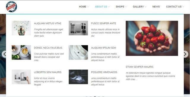
This plugin will have slides that look like this.
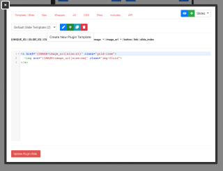
Let's say you later decide that you want all of the cropping aspect ratios of the images in the gallery to be set at 1:1, but when you open them, you want them to open at their original full ratio size. This is an example of when we would add another plugin slide template. As shown below, you open the plugin template, and click the green plus sign to create a new plugin template.

You can also name your different plugin slides to prevent confusion by clicking on the blue pencil icon next to the green plus icon. Now you can add your HTML for the new template. It is only slightly different in this example.
xxxxxxxxxx<a href="{IMAGE=image_url|size:xl}" class="grid-item"> <img src="{THUMBNAIL=image_url|size:sm}" class="img-fluid"></a>You can see the difference in these two plugins. The previous one allows you to open it and it is the same image with the same cropping and aspect ratio. This final one allows you to have two images, a thumbnail and the full sized image.


This article explains how to create and use the mega menu functionality in Leiout navigation menus.

This article explains how to install and use Google's translate javascript library and implement a b...

This help article explains the CSS mix-blend-mode property and how to incorporate it with hero image...